

Color is more than just a visual element; it has a profound impact on our mood, emotions, and overall well-being. This understanding of color psychology has significantly influenced home decor trends, especially as more people seek to create spaces that foster positivity, relaxation, and inspiration. In the United States, the focus on using color intentionally in interior design is growing, with homeowners and designers alike turning to color psychology to craft environments that feel as good as they look.
The Basics of Color Psychology
Color psychology explores how different hues affect human behavior and emotions. Certain colors are known to evoke specific feelings or reactions, which can influence everything from productivity to relaxation. For example:
- Warm Colors (e.g., red, orange, yellow): These tones are energizing, attention-grabbing, and stimulating.
- Cool Colors (e.g., blue, green, purple): These shades are calming, soothing, and associated with tranquility.
- Neutral Colors (e.g., gray, white, beige): Often used to create balance and serve as a backdrop for other colors.
Understanding these associations helps homeowners select color schemes that align with their personal needs and desired atmosphere.
Current Home Decor Trends Shaped by Color Psychology
- Earthy Tones for Grounding and Comfort
Shades inspired by nature—such as terracotta, olive green, and warm browns—are increasingly popular in American homes. These colors evoke a sense of stability, grounding, and connection to the natural world. Earthy palettes are often paired with natural materials like wood and stone to create a harmonious and comforting environment. - Blues and Greens for Calm and Relaxation
Blue and green hues are dominating home decor trends as people seek spaces that promote relaxation and mental clarity. Soft blues mimic the serenity of the sky or ocean, while greens evoke the refreshing qualities of forests and plants. These colors are particularly common in bedrooms and living rooms, where creating a calm atmosphere is key. - Pops of Yellow for Joy and Optimism
Yellow is making a comeback in home decor, especially in kitchens and home offices. Known as the “happy color,” yellow stimulates creativity, boosts energy, and brings warmth to a room. To avoid overwhelming a space, homeowners are using yellow in smaller doses, such as accent walls, throw pillows, or decorative art pieces. - Neutral and Minimalistic Palettes for Versatility
Neutral tones remain a staple in interior design, but their use has evolved to prioritize warmth and coziness. Soft beiges, creamy whites, and taupe shades are being paired with textures like woven fabrics and natural fibers to prevent spaces from feeling cold or sterile. Neutral palettes also offer flexibility, allowing homeowners to add colorful accents that can easily be updated over time. - Rich Jewel Tones for Elegance and Depth
Jewel tones like emerald green, sapphire blue, and deep burgundy are trending in dining rooms, libraries, and other formal spaces. These colors add a sense of luxury and sophistication while still creating a cozy and inviting feel.
Using Color Psychology to Create Positive Vibes
- Define Your Intentions for Each Room
Think about how you want to feel in each space. For example:- Bedrooms might benefit from calming blues or greens.
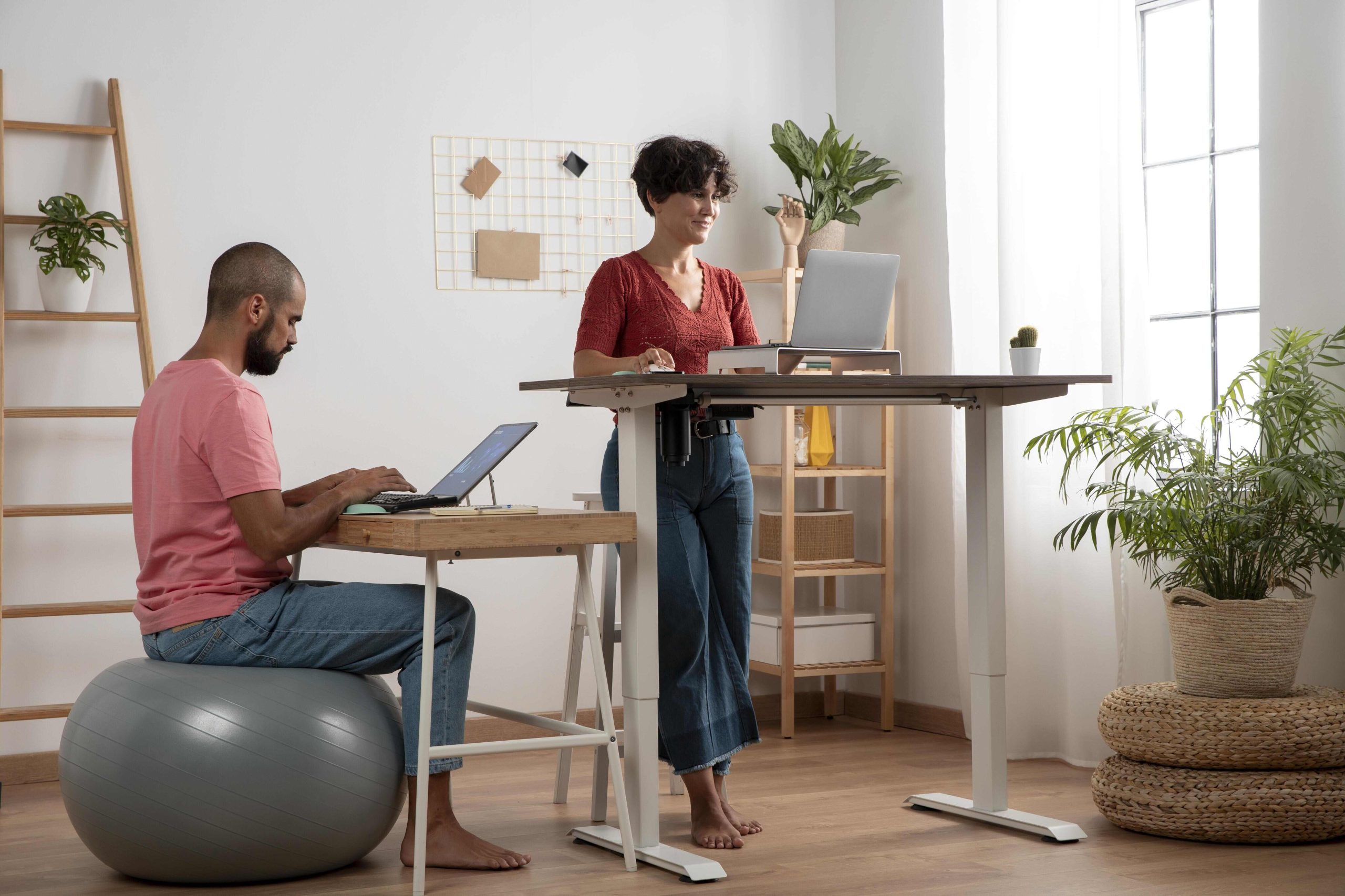
- Home offices could incorporate energizing yellows or oranges to boost focus.
- Living rooms may feature warm neutrals for a welcoming vibe.
- Balance Is Key
While bold colors can make a statement, too much intensity can feel overwhelming. Pair vibrant hues with neutrals to maintain a balanced and harmonious look. For instance, a bright yellow accent wall can be complemented with white furniture or gray decor. - Use Color Strategically
Colors don’t have to dominate a room to make an impact. Incorporate them through accessories like rugs, artwork, throw blankets, or curtains. These smaller touches allow you to experiment with trends without committing to a full renovation. - Consider Natural Light
The way colors appear in a room depends heavily on lighting. Test paint samples or decor items in natural and artificial light to ensure they create the desired effect. - Incorporate Biophilic Design
Pairing color with natural elements like indoor plants can amplify its psychological benefits. Green walls, for example, create a lush and rejuvenating effect, while wood tones add warmth and texture.
The Emotional Impact of a Thoughtful Color Palette
The intentional use of color in home decor does more than enhance aesthetics—it can transform how we feel and function in our spaces. By aligning colors with emotional and psychological needs, homeowners can create environments that reduce stress, improve focus, and inspire joy.
Conclusion
Color psychology is reshaping the way Americans approach home decor, offering a practical yet creative way to design spaces that support mental and emotional well-being. Whether through calming blues, energizing yellows, or grounding earthy tones, the right colors can turn a house into a haven. By considering the emotional impact of each hue and incorporating them thoughtfully, you can create a home that truly feels like a reflection of your best self.


Leave a Reply